
Piece and quiet...
I’ve been sewing a lot lately…not just talking about it…but actually doing it. I’m not alone. Both Susan and Heather are working on sample quilts for the shop. The dog days of summer brings out the hermit in me. I like warm weather—but stormy humid warm weather? That’s just the opposite of bitter cold snowy weather. Either way, it’s time to hunker down inside, make some progress on all the projects I have in the works and just sew quietly. Oh the Zen of it all!
 What are we all working on?
You might say all the new fabrics have inspired each of us.
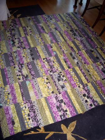
Last weekend’s hurricane coverage captured my attention. So with one eye on CNN and the other on my machine, I thought I’d knock out something easy because distraction and precision piecing just don’t go well together. Neither does sipping wine and piecing complex patchwork. Don’t drink and sew my friends—and if you do—keep the sewing simple! Since seam allowances don’t matter with the Urban Amish, I figured this was the perfect Irene/Pinot Grigio project. I made a new shop sample using Kitty Yoshida’s Prospect Park fabrics in the very sophisticated grey, pistachio and orchid color way.
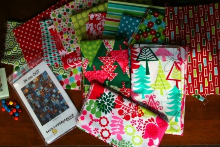 Heather is taking on the new holiday quilt store sample project this year and plans to blog about it soon—so stay tuned. She’s using lots of the fun new xmas fabrics in the Blue Underground Studios’ In & Out pattern. The “out” block will make for some fancy fussy cutting!
And then there are the batiks…sumptuous, color saturated and totally captivating! We’ve been restocking these beauties all summer and have built up a respectable collection. Of course, there’s more to come. In the meantime, both Susan and I have tackled two new shop sample projects using two of the newer Blue Underground patterns.
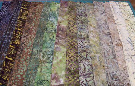 Susan’s Eclipse is a study in earth tones. Her color palette includes light, medium and dark batiks in beige, tans, browns and a variety of greens. This quilt definitely evokes fall and will probably earn the coveted back wall space for display.
My batik project is the new Gemini pattern using hot color with high contrast blues and oranges.
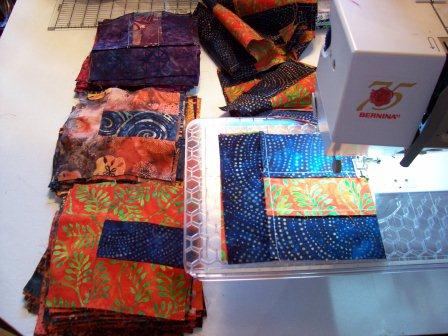 The blocks are done and I’ve tried laying them out. But honestly, it’s not working. I’m afraid I may have too much contrast here so the plan is to add some nuance with red, purple, brown and rust tones. But before I add in the new colors, I have to take my blocks apart—tedious yes—but sadly necessary. Since I’m dog sitting this weekend for my sister’s pooch, I’m planning to stick close to home and spend some quality time with the puppy and my seam ripper!
Friends—FYI, seam ripping and wine sipping do go together nicely!
Have a great weekend and see you soon.
 Quiltology
 Post a Comment
 25 References
From SAD to GLAD...a happy 16-Patch quilt...
Long time—no blog.
 Instead of posting, I’ve been busy working on quilting projects. So in the next few weeks, I plan to catch up on the blogging by posting pictures and patterns of some of the things I’ve been working on including my new Amy Butler quilt (made from the uneven 9-patch block,) T-shirt quilts (with a new tutorial) and my string quilt project in which I’m using my dad’s silk ties.
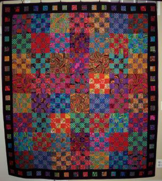
In the meantime, here’s a picture of my finished Kaffe Fassett 16-Patch.
Some of you may recognize this super simple pattern because Kaffe has used it in many of his books. In fact, he was using the 16-patch block to produce a colorful collage effect long before he had his own line of fabrics.
The idea here is simple—pair contrasting fabrics to produce the wow effect. You'll create a harmonious effect by using fabrics that speak to one another. The way to achieve this effect is by pulling a secondary color from one print and using it as the dominant color in the second print. And keep the value consistent. Don’t use a light with a dark. Instead use different colors with the same degree of saturation.
Kaffe didn’t add borders to any of his quilts but I felt that mine needed “something.” And that something needed to read modern. So I created what I like to call my “slideshow” border by using left over squares from my 16-patches. I alternated the scrappy squares with solid black and then flanked them on either side with the black inner and outer borders. I finished with a purple binding—mostly because I craved one last color splash around the edge!
SAD buster...
I have a friend who suffers from SAD so badly that she moved from Chicago to the sunny confines of Miami Florida. Right about this time every year, as I look at the gray skies and muddy landscape around me, I think of her and wonder if I shouldn’t do the same thing.
SAD is the seasonal affective disorder that’s also known as the winter blues—or in extreme cases—winter depression. Some say it’s treatable with light therapy but I prefer to self-medicate with my own brand of color therapy. Call me whacky, but my particular pseudoscientific practice involves playing with lots of fabulous fabric in deep soulful saturated colors.
First, I begin with the big dig.
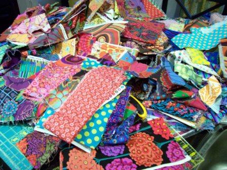
Here’s where collecting fabric—be it scraps from other projects or piles of fat quarters really comes in handy. And if you happen to own a quilt shop—better still. I have lots of the ends of bolts to toss into the mix. I don’t consider myself a pack rat for saving this stuff—and you shouldn’t either. Instead we’re like those poor little squirrels that need to store up lots of nuts for the long winter months. This is really about basic human survival. Right? Right!
Next, I start making little mini-piles. I put “like” fabrics together. Things I think will play well with one another. I’ve organized by color and genre so I might have a pile of reds, blues and greens to build color palettes and then things like 1930s repros and batiks for specific projects TBD at a future date. But my favorite pile—the one calling my name—is the SAD busting Kaffe Fassett fabric!
I’m posting a picture of the Kaffe pile so you too can eyeball the beauty of it.
Now, breathe in…breathe out. Repeat as often as necessary until you feel a sense of calm come over you.
One of my favorite Kaffe quilts is his 16-patch—quite simply a 4-patch x 4. He’s used this pattern in lots of his books starting with Glorious Color many years ago before he had his own collection of prints. In his latest book Quilts En Provence he’s created two versions—one with a low contrast pastel palette and the other in his signature high contrast jewel tones. Guess which one I like the best?
I’ve started making my blocks. Since these finish at 10”, I’m planning to do 7 blocks across by 9 rows down, for a total of 63 blocks. I’m using 3” strips to piece the 16 patch blocks. And I’ve discovered that two strip sets will yield 3 full blocks. This means that 63 blocks divided by 3—that equals 21 strip set combinations—for a total of 42 fabrics.
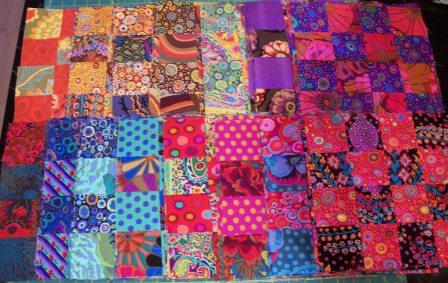 I’ve used high contrast combinations with warm and cool colors to achieve the big visual “POP.” Typically I start with a big print focus fabric and then pull a secondary color from that for the second fabric so that the colors speak to one another. I also avoided duplicating fabrics so there’s lots of visual variety.
As of this post, I’ve got 45 blocks done with 18 more to go.
Hopefully I’ll be pulling out the design wall this weekend and laying out the top.
Stay tuned…ccc
A good day to stay home and sew...
Today the weather service is predicting a big winter snowstorm. We’ve been lucky so far this winter, just a few sprinkles here and there so I guess we’re overdue. It looks like it might be a good time to stay inside, sip something warm and update the blog.
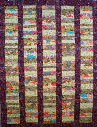 Fall Foliage is our newest Lincoln Park Patchwork quilt featuring a collage of earth toned fabrics from some of our favorite designers. This one was a real color play. Inspired by Martha Negley’s Autumn Medley citrus maple print, I added in the burst (sage green) and brown twigs for an organic feel.
I have to admit—I’m a fall girl. I just love sweater weather. The cool crisp weather makes me feel downright frisky. But the thing I love most about that time of year is the glorious color! Those couple of weeks where the trees take on a surreal golden—and then fiery glow—I’m in my element.
Itching for some color work, I opened up the maple print on the cutting table and started pulling lots of bolts from around the shop to see what worked well with it. Not surprising some of Kaffe Fassett’s bold high contrast prints added the perfect colorful compliment —and then for a little spice—a dash of Amy Butler, Denyse Schmidt, Patricia Bravo and Jay McCarroll.
There's nothing like the thrill of opening up a new bolt of fabric and taking in the WOW of a large scale print. I’ve spent lots of time wondering what to do with these kinds of prints. Sometimes it seems like a shame to cut them up. But once I do, I get another kind of high—the patchwork high—induced by splashes of wonderful color poking out in the most unexpected places. I suppose cutting up fabric is a leap of faith. You just have to dive in and go for it. Scrappy patchwork has a magic to it—we just have to let it happen.
stay warm!
colette
hey--we've been published...
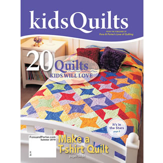 I got a very nice b-day surprise in yesterday’s mail. My first published quilt pattern! Fons & Porter’s Quilts for Kids edition features our Quiltology T-shirt quilt with our notes on tips and techniques for duplicating the design. (see page 55!)
This is a special newsstand only issue. I’ve ordered copies which will be available in the shop next week.
Can’t wait? Order online directly from F&P.
There’s a little drafting involved in duplicating this pattern—but it’s relatively easy and a great way to learn how to design your own patchwork top.
We’re offering a class in April, so we can help you create your own patchwork pattern based on the sizes of your shirts. Call the shop to register.
cu soon,
ccc